I have been serving Google AdSense on my blog for a while. My traffic is pretty modest and so do is my earnings from Google AdSense.
I have CTR about 0.7% on this blog, and I want to improve that, by getting at least 1% CTR. Some time ago I made the first experiment with changing layouts for serving ads. That didn't work as expected, and I'm changing again.
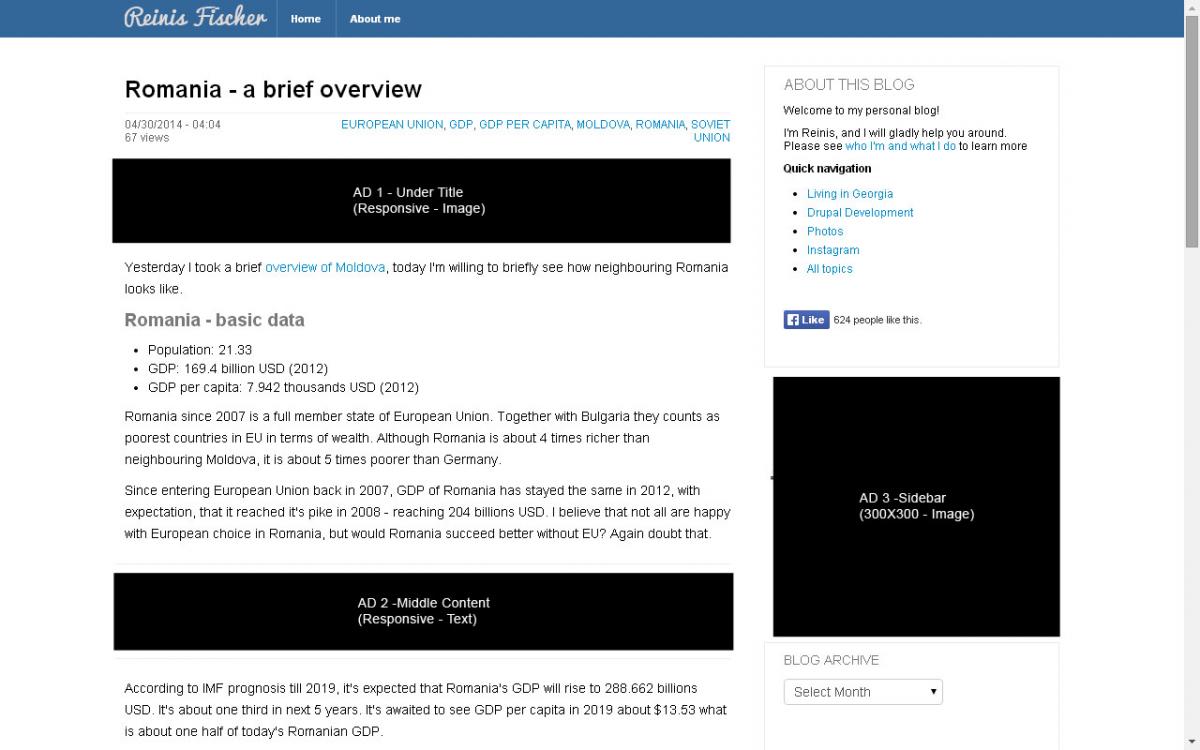
Meet the new layout:

For now, I am serving maximum allowed Google AdSense ad units on my site - 3. I have placed first under Title, and I'm using for that Responsive add Image only. Then I'm having 2 Responsive ads, this time text only. And I'm having third ad unit - Sidebar 300X300 with image only.
Why I have chosen Responsive ad units?
Because it's responsive. It works great on any mobile phones and tablets. The cons of Responsive ad unit so far I have noticed, the CPC ir much lower for regular ad units. But since my aim is to improve CTR this time, rather CPC, I'm not paying to that a much (at this moment). In case those ad spaces will convert in higher CTR, I will change them to popular ad units.
Why, image only, text only?
Its well-known fact that Google delivers better ads if the settings are intact. I just wanted to make them appear visually better.
I will leave the ad units for all month of May intact, and make some modifications or changes next month.
I believe this ad unit positioning could increase CTR in my blog a little over 1%.