
Restaurant Antre Batono Ubisa
Restaurant Antre Batono Ubisa is located near the Ubisa village in the region of Imereti, Georgia some 170 km from Tbilisi.We made a stop here and discovered this lovely place, while traveled to Batumi via Tbilisi - Senaki - Leselidze highway at the end of April 2019.This place serves typical Georgian cuisine, VISA is accepted and…

Restaurant Marani in Vertkvichala
Restaurant Marani Vertkvichala is located near the village Vertkvichala on Tbilisi - Senaki - Leselidze highway some 160 km from Tbilisi in the Imereti region of Georgia.We stopped here for a brief stop to take a meal and have some rest before heading back to Tbilisi (from Batumi)Restaurant MaraniThe place looked like a lovely…

Park Inn by Radisson Riga Valdemara
Built in 2016, Park Inn by Radisson Riga Valdemara invites its guests to stay on the western side of Daugava River with good connections to the Old Town, Riga International Airport and main sights. Guests can enjoy a meal at the onsite restaurant, enjoy views from terrace and exercise in the fitness centre.We stayed at this hotel at the start of…

Hofbrau Munchen Gudauri
Hofbrau Munchen Gudauri is a roadside cafeteria located in Georgia (some 20 km from Gudauri)I'm not very well familiar with Hofbrau Munchen brand but seems this is a popular German brewery brand in Germany and abroad, the one located on Gudauri highway seems is not actually affiliated with the German brand (but you never know). See more…

Tsalka
Tsalka is a town and municipality center in southern Georgia's Kvemo Kartli region located some 100 km from Tbilisi. Next to Tsalka is located the largest water reservoir in Georgia - Tsalka reservoir.
Town of Tsalka is known by many abandoned houses next to the lake, and in fact, while traveled here for the…

Restaurant 'Piano" in Liepāja
The 'Piano' is a World class restaurant located in Promenade hotel in LiepājaEnjoy delicious meals and a romantic, relaxed atmosphere at "Piano" restaurant located in "Promenade Hotel". I first discovered and tried Piano restaurant back in September 2017.Restaurant Piano in Liepāja On the extensive restaurant menu, you will find…
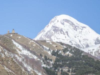
Mount Kazbek
Mount Kazbek, is a dormant stratovolcano and one of the major mountains of the Caucasus located on the border of Georgia's Kazbegi District and Russia's Republic of North Ossetia–Alania.It is the third-highest peak in Georgia (after Mount Shkhara and Janga) and the seventh-highest…

Hotel Stancia Kazbegi
Hotel Stancia in Kazbegi is a great and cheaper alternative to the more stylish and lavish Rooms Kazbegi hotel. Featuring a garden and a restaurant, Stancia Kazbegi is set in Stepantsminda. Among the various facilities of this property are a terrace and ski storage space. The hotel also offers free WiFi as well as a paid airport shuttle…

Tsalka Lake / Water reservoir
Tsalka reservoir - is the largest water reservoir in Georgia, located in the Tsalka municipality, some 100 km from Tbilisi, at 1506 meters above the sea level in the valley of Khrami river.
The total area for Tsalka reservoir is 33.7 km², Maximum depth - 25m, while the average depth of 9,3 m. Reservoir…

Hotel Talsi
Hotel “Talsi” is located in a picturesque place, next to Vilkumuiza lake. Hotel "TALSI" offers 53 different standard Single, Double rooms and comfortable Suites. I booked Hotel Talsi, for a couple of days (nights) in August 2017. As there are not many hotels located in Talsi, Hotel Talsi seemed like a logical choice, which actually was…

Birtvisi Canyon in Georgia
Birtvisi canyon is located in the Tetri-Tskaro district in Kvemo Kartli region about an hour drive from Tbilisi. Canyon is ideally suited for those loving hiking (see: Hiking In Birtvisi Canyon (Hidden Trails Of Georgia)) and outdoor activities.There are many smaller and larger gorges, rocks and of course amazing nature. Also, the…
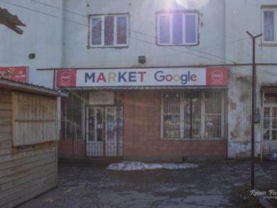
Google Market Kazbegi
There has been a Google market in Georgian Stepatsminda / Kazbegi town at least since 2011. No, you cannot get here cloud storage or keyword ideas for your next AdWords campaign, instead, there are tasty Georgian lemonades and other goodies you can find in almost every regular kiosk in Georgia.First discovered back in 2011, in April 2019…

Kobi Gudauri Cable Car Station
Kobi Gudari cable car has been opened for public since January 2019. I first discovered in it early April 2019, while having a road trip Tbilisi - Gudauri - Kazbegi (Stepatsminda).Not far from the cable car station there is located Kobi mineral water plant. Kobi cable stationGudauri - Georgian Winter Capital for skiing,…

Mount Arejvani
Mount Arjevani is located in the central part of Georgia, some 70 km west of the Tbilisi. The top of Mount Arjevani is 2,757 meters above sea level or 779 meters above the surrounding terrain. The width at the base is 24.5 km.The terrain around Mount Arjevani is mainly hilly. Mount Arjevani is the highest point…
March 2019 Dividend Income Report - $188.36
Welcome to the twenty-third (#23) dividend income report, covering earnings I've made from dividend-paying stocks, peer to peer lending (both fiat and cryptocurrencies) in March 2019.The last March was very exciting, it has not only beaten the previous year's March by quite impressive 256%, but it also was…
Tbilisi for kids (17 Places to Visit)
Shopping, eating ice cream, spending time outdoors or at cool amusement parks.
Tbilisi has a lot to offer for both grownups and their offsprings. Keep reading to find more about 17 kid-friendly places in Tbilisi
April 1st marks already the eighth anniversary since I've been living in Georgia. It was back on April 1st, 2011 I first…

Asureti / Elisabethtal
Asureti is an interesting village situated on the road Koda - Tetriskaro, some 45 km from Tbilisi in Georgia. Discovered by accident, while doing (trying to do) a trip to Ninotsminda (in the region of Samtskhe-Javakheti) in January 2019.I had heard before about former German settlements here in Georgia from…

Cinevilla Studio backlot
Cinevilla is a backlot in the Tukums Municipality in Slampe parish, Latvia, and was created for the outdoor shootings of the feature film Defenders of Riga.It is the only backlot in Latvia, and consists of replicas of historical buildings and constructions of Riga, the capital of Latvia.…
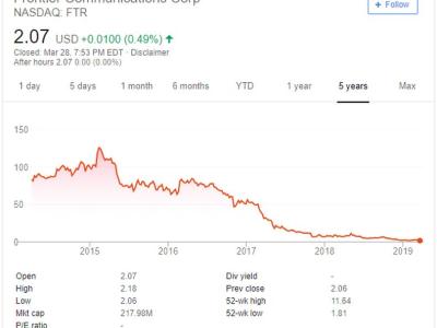
My First Option Trade: FTR Aug16'19 2 Put @0.45
Now, this is exciting - in the late evening of March 28th, 2019 (GMT) I made my first options trade (s).To get to this point it took me a couple of months and a lot of reading, talking and watching YouTube videos. A huge learning curve and a lot of incomprehensible. Anyway - I just made it, my first options trade - probably really…

Jūrmala airport
Jūrmala Airport (ICAO: EVJA) is an airport located 5 km (3 mi) in the Engure parish, Latvia, southeast of Tukums. The airport is located in the territory of the former army airfield.All of the airport's technical infrastructure, runway and buildings are what was left of the former Soviet military…
Latest articles
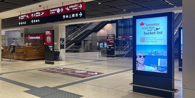
Berlin Brandenburg Airport
In April 2026, I had my first experience with Berlin Brandenburg Airport (BER) while flying the Riga–Berlin–Riga route with airBaltic. This was my first time using Berlin’s main international airport, and overall, it left a solid impression—modern, functional, and relatively easy to navigate. About a decade ago, I had the chance to travel through…
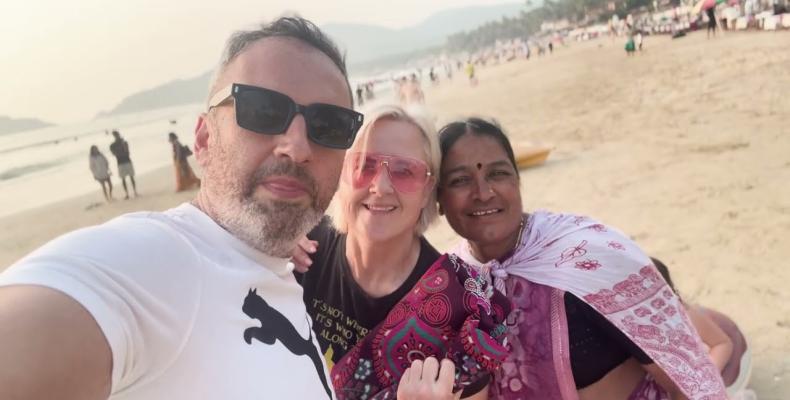
Mumbai & Goa / India Trip
It has already become something of a tradition for us - escaping the cold during our daughter’s winter school break and trading grey skies for warmth, color, and a slower rhythm of life. Each year, we carve out about three weeks to leave Tbilisi behind and head somewhere sunnier. And more often than not, that “somewhere” turns out to be India.Our…